Friday, March 9, 2018

Content

While working on the Table Of Contents, I only now realize there is a strong theme relationship between it and the Cover Page. The Table of Content does not only indicate the information provided by the magazine, it reveals a consistent color style and layout for the rest of the magazine. Seeing that I haven't completed the cover page or have definitely decided on a layout, there has been a limit to my ability to create the Table of Content. None the less, I took this opportunity to experiment with many different applications in which I could use to generate my magazine.
I've had a lot of experience with the Apple application Pages, and though that is my preferred application for any writing assignment, it doesn't provided many features when trying to design a magazine.
From a past project done in class, I was able to discover an amazing application and website which was designed with graphics in mind. The application, Canva, is my best friend. It provides an endless amount of gadgets and features in which one can incorporate into their cover page, table of content, or two page spread. I highly recommend Canva to anyone wanting to create a magazine or any form of poster.
As stated before, their were some details I still haven't planned out, which limited my capability to create a FINAL Table of Content. Final being the key word, I was still able to make two, in my opinion, amazing Table of Contents to-be.
(Please keep in mind that my magazine will consist of more stories/pages. This is just a preview to what the Table of Contents could be. The images are place-holders. All were not a creation of mine, they were provided for free by the Canva website.)

During my first attempt, the youthful and color side of me came out a lot more than I anticipated.


The color scheme is more towards the feminism side. Color has a major impact on attracting a specific gender. Furthermore, I do maintain an informational layout, but there is a lot going on the page. The images are framed in a unique manner, appealing to the youthful side, but it takes a lot of the elegant and simplicity I was hoping to have.


My second version of Stagger's Table of Context consist of two main colors. Black and white. Referring to AllTop's article, The psychology of color for web designers, neutral colors is the way to go when wanting elegance and clarity. We live in the modern era, therefore we must remember the impact of a black and white combo.


I really like this Table of Contents. It provides shot intriguing headlines, as to not to overwhelm the reader. At first, there may seem like their is a lack of youth, but the unique and compelling frame of the images preview a story to come. Like the Andre Stanton referred to in his Ted Talk "The clues to a great story", the frame of the images promise that they will take you to a story that will be worth your time.
Although I wasn't able to finalize my Table of Content, I'm confident that time was not wasted, rather I gain a better understanding on how every element of a magazine must work together and tie in to each other.


Citation:
>Pages. (n.d.). Retrieved March 09, 2018, from https://www.apple.com/pages/
>Canva. (2012, July). Retrieved March 09, 2018, from https://www.canva.com/
>Colbert, A. (2011, February 11). The psychology of color for web designers [infographic]. Retrieved March 09, 2018, from https://www.alltop.com/viral/the-psychology-of-color-for-web-designers-inf
>Stanton, A. (n.d.). The clues to a great story. Retrieved March 09, 2018, from https://www.ted.com/talks/andrew_stanton_the_clues_to_a_great_story/transcript

Thursday, March 8, 2018

WANTED: The Perfect Font

The search for the perfect font begins!
For guides, I looked to Smashing Magazine. An article about "5 Principles for Choosing and Using Typefaces". The article mentions that font represents the information stated in the text. The text may be well written, factual, and intriguing, but without a proper font to go with it, the message will not get the recognition it deserves. Font provokes emotions as well as reflects on the personality of the article/magazine.
In a fashion magazine, font has a large impact to the magazine's overall atmosphere. The feeling i'm going for is simple, yet youthful. In order to make a font simple and professional, you must relay on hard edges and clean lines, but add a twist to make it more youthful. Where could one find such a font?
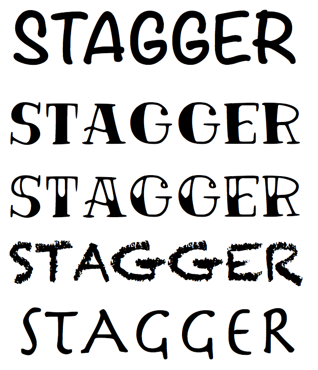
Pinterest to the rescue! Using the 60 available pins on Stoklosa's folder on Media - Print, I found various new sites which offer a variety of fonts. After filtering through tons of fonts, I've narrowed it to these five:

I'm untimely between the second and third font. Both are from the TM Vinograd font-family.
To pick a final choice, I believe that the second form of Stagger will better suite the title of my magazine as well as the theme of the magazine. It is clean, mature, but also very youthful. Exactly what I wanted.
Coming into this assignment I was very nervous and worried that I would spend a ridiculous amount of time finding a font I wouldn't even love. Learning to manage my time and to limit the options to 5 top ones really helped ease the progress. I feel confident in my choice, which was not something I expected to say.

Citations:
>What Font Should I Use? 5 Principles for Choosing and Using Typefaces. (2010, December 14). Retrieved March 07, 2018, from https://www.smashingmagazine.com/2010/12/what-font-should-i-use-five-principles-for-choosing-and-using-typefaces/
>Media - Print. (n.d.). Retrieved March 07, 2018, from https://www.pinterest.com/tstoklosa/media-print/
>Fresh Free Fonts 2017 For Graphic Designers | Fonts. (n.d.). Retrieved March 07, 2018, from http://graphicdesignjunction.com/2017/02/free-fresh-fonts/
>TM Vinograd Free fontfamily. (n.d.). Retrieved March 07, 2018, from https://typemate.pro/tm-vinograd

Wednesday, March 7, 2018

Inspiration through Wonderland


I think the cover lines narrows the cover image. The fact that most cover lines are small and plain is something I can appreciate; it doesn't take any focus away from the cover image. The decision of making text which curves with the objects in the image adds uniqueness. The yellow color for the text is a bit surprising. It makes the cover lines somewhat hard to read, especially the line "Let me be.." However, the yellow also making the text subtle; it doesn't consumes the eyes of the readers. Overall, this magazine cover is simple and charming. It holds my attention, someone who isn't even a
                                                           fan of the artist on the cover: Lana Del
                                                           Ray.


The color scheme and makeup on the model is stunning! Match that with the "I don't care" expression on the model face... WOW!! The truth of how make-up, color, and hair has nothing to do with one's beauty speaks volumes with me. The colorful cover lines attracts the eyes, but it matches the color scheme on the model/cover image, therefore acting as a prop for the model. The image is covered up by the masthead and cover story, yet in no respect do they take away from the empowering cover image. This cover page is definitely one I will draw inspiration when editing.


Citations:
>'Honeymoon' by Lana Del Rey | Wonderland Magazine. (2015, August 21). Retrieved March 07, 2018, from https://www.wonderlandmagazine.com/2015/08/21/honeymoon-lana-del-rey/
>WONDERLAND Sept/Oct: Teaser #1 – Wonderland. (2013, March 21). Retrieved March 07, 2018, from https://www.wonderlandmagazine.com/2012/08/29/wonderland-septoct-more-teasers/#


Tuesday, March 6, 2018

Audience

Knowing your audience is essential to the creation of any project. Especially when the success of the company depends on the audience .
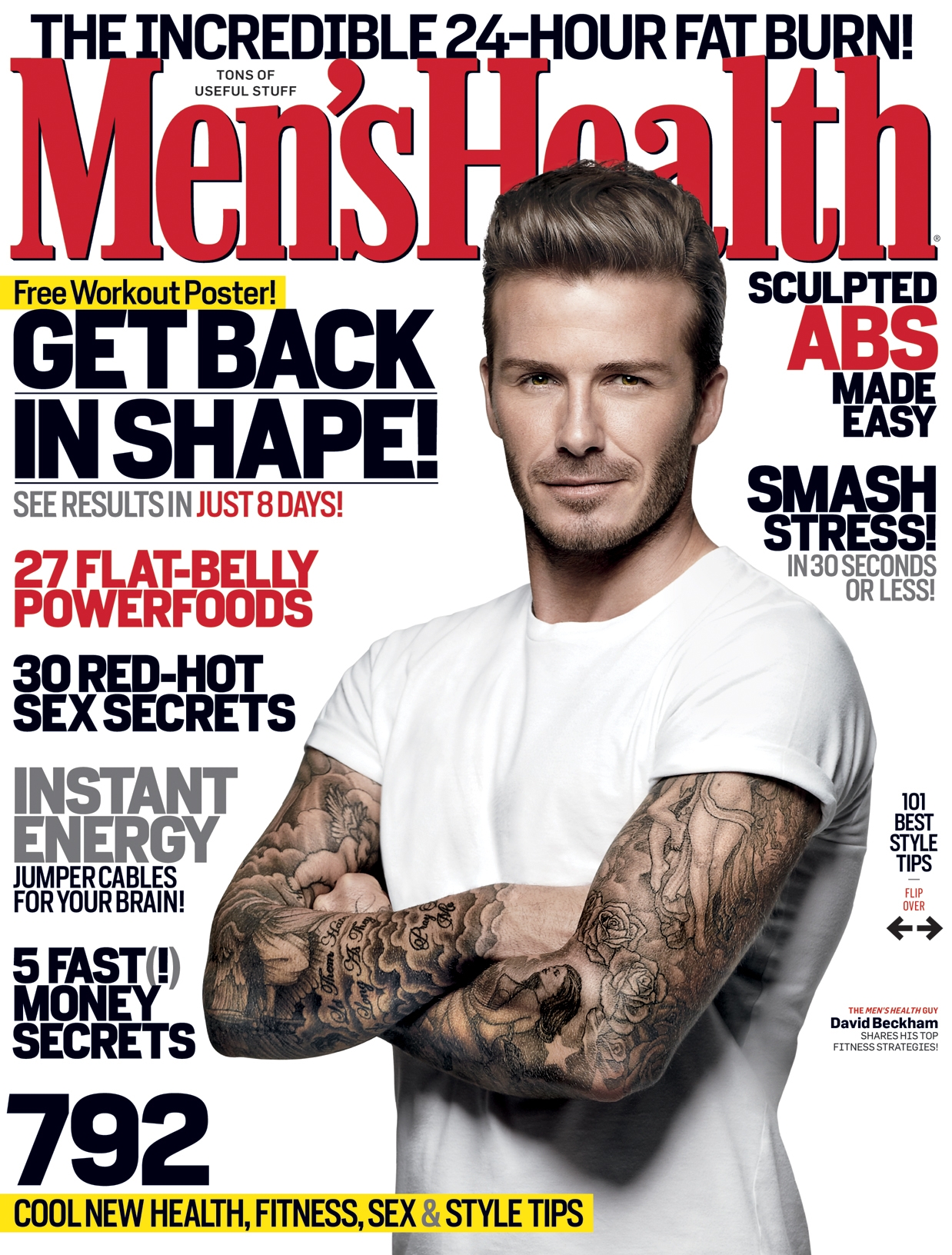
When we think of fashion magazines, most of us believe that women are the target demographic. Although there exist a superfluous amount of fashion industries focusing on women, today we can find a large range of fashion magazines who are targeting men: Men's Health, and GQ.


The target audience of Stagger is mainly middle class, young adults (mostly women), however it isn't exclusive to a singular demographic. Based on the Consumer Expenditure Survey, the middle class spends the biggest amount money on Entertainment in terms of their budget. Not only is the middle class more inclined to buy magazines, they are encouraged by the diversity in communities. An article that captured my eye, Understanding Social Class as Culture, indicates that the middle class values "[their] ability to make choices, pave [their] own paths, and voice [their] ideas and opinions". My magazine will link this need to vocalize one's beliefs through the use of photojournalism and the stories on culture.

Yet there is still one question to consider: How will my magazine attract both sides: men and female?

Here is how:
  • Attention: Psychographic data on young adults show that those who make up this generation seek representation. The lifestyle and values of a person makes them who they are. In order to capture the attention of young adults, I will be utilizing relatable beliefs, cultures, and subjects from their generation that attract the different demographics. 
  • Similar likes: The stories and clothing product provided in the magazine will captive both men and women. A story of an individual's lifestyle and customs, will included an outfit and cultural background. While an outfit may be the pivot of the female's attention, men may find the publication of the cultural background enchanting. By having fashion and heritage work together, I can draw both genders to the magazine. 
  • Fashion: The middle class, young adults particularly enjoy their fashions. Following on the latest trends and industries, is something both genders find significant. However, there has been a shift. Young adults, or millennials, now focus on what is comfortable, affordable, and indie. Brand is no longer the focus of fashion. Both males and females appreciate fashion, puts the customers first. Stagger will prioritize their audience rather than the fashion industry. Charity donation will aid in the making of a platform, therefore Stagger will be donating a portion of their profits to local charities; charities which the costumers know about and find important. I'm still undecided about the idea of how the local charities will be chosen. Who knows! I might let the public decide through a survey which would be needed to be cut out from a page of the magazine and then mailed. In doing so, I would encourage more people to buy more copies of the same magazine issue. 
I imagine that represention of a culture will be challenging. This thought has yet to scare me away, therefore I am going to take it as a good sign!


Citations:
>PROFILE: YOUNG ADULTS. (1995, April 03). Retrieved March 01, 2018, from http://adage.com/article/news/profile-young-adults/83060/
> Murphy, A., Sieracki, J., Fuentes, T., Rense, S., Crosbie, J., Daly, A., . . . Struyk, T. (n.d.). Men's Health. Retrieved March 01, 2018, from https://www.menshealth.com/
>Maxim. (n.d.). Retrieved March 1, 2018, from https://www.bing.com/cr?IG=4904989C450243CCB4BA6A02D697A392&CID=0DD960FB08F262283E536B57095D63C2&rd=1&h=Bk3EZnR-a1k70ru8J-HDPKYSIs3BPE2YYSiI6bpgOlo&v=1&r=https%3a%2f%2fwww.maxim.com%2f&p=DevEx,5063.1
>GQ - Mens Fashion, Style, Grooming, Fitness, Lifestyle ... (n.d.). Retrieved March 1, 2018, from https://www.bing.com/cr?IG=64EDC69DB18C40A1AF59566DC993169F&CID=1D4C903C0AC566B035539B900B6A6779&rd=1&h=0lGEwik2E8S8vSLJ1Nk1z5E6e0TqfZ3kInyWAnzbCZE&v=1&r=https%3a%2f%2fwww.gq.com%2f&p=DevEx,5058.1
>Understanding Social Class as Culture. (2016, August 17). Retrieved March 01, 2018, from http://thepsychreport.com/science/understanding-social-class-as-culture/
>PROFILE ASOS: Asos Timeline. (n.d.).

Monday, March 5, 2018

You got Mail!

Coming home after a long shift of work, I checked the mail as I walked into my house. To my surprise, a fashion magazine, asos, is addressed for my older sister. Seeing that she moved out 3 years ago, I saw no harm in keeping it. The cover image is of a famous young actor, Cole Sprouse, but that wasn't what attracted me. What attracted me the most was its simplicity. All the text on the cover maintains the same font and are white. Also, the colors making up the cover are light and clean, therefore not overwhelming the readers.

I decided to do some research on the magazine. This is what I learned:
  • It distributed heavily in the UK.
  • It focuses on fashion trends, but typically implements popular celebrities to express their fashion line.
  • Their target audience mainly consist of 15-26 year old, high-middle class, females.
  • A large portion of readers can be found through their online platforms.
  • They ordinary stray away from lots of cover lines.

I wasn't thinking of fashion as path I would take with my magazine, but I see many opportunities with this category. Although standard fashion magazines tend to relay on a set of trend, I want to incorporate different cultural fashion.
I'm not sure of how I will be able to capture a variety of cultural outfits, but I'm sure i'll come up with something.


Citations:
    >Shop the ASOS Magazine. (n.d.). Retrieved February 27, 2018, from http://us.asos.com/women/shop-the-magazine/cat/?cid=25436
    >Cole Sprouse. (2018, February 25). Retrieved February 27, 2018, from https://en.wikipedia.org/wiki/Cole_Sprouse
    >ASOS (magazine). (n.d.). Retrieved February 27, 2018, from http://ladygaga.wikia.com/wiki/ASOS_(magazine)
    >All products require an annual contract. Prices do not include sales tax (New York residents only). (n.d.). ASOS magazine: monthly

      reach by demographic UK 2015 | Statistic. Retrieved February 27, 2018, from https://www.statista.com/statistics/382304/asos-
      monthly-reach-by-demographic-uk/

Saturday, March 3, 2018

Scheduling

With 45 days to complete this project, organization is everything.

Being able to remain on schedule is something I have mastered. It gives me a sense of relief to see distinctly where I should be on the project. I hate having to cram something in because of timing issues. I have given my self plenty of time to focus on important elements of this project.

  • 6 Days for Research: I need to focus on target audience. Every decision for my magazine comes down to target audience. The more information I can gather about them, the better. Knowing that research is my least favorite element of this project, I find that 5 days (including a weekend) will be more than sufficient time for me to collect extensive knowledge of my target audience. Not only must I find information on my target audience, but I must research special elements which photojournalistic magazines have and how I can incorporate those elements with fashion. Even writing about it now, I know that with all this information, all other aspects of this project will be much easier. 
  • 3 Days for Table of Context: In terms of "Table of Context", I am dictating which stories would best suite my magazine. The Table of Context is something I've seen lead many students to lose points, therefore I have set out a specific slot of time to focus on the elements which would evaluate the quality of my Table of Context. 
  • 4 Days of Taking Pictures: The process of selecting pictures and positioning a model is usually not an easy task. From lighting, background, and color, their are lots of details which must be decided in order to produce a stunning picture. I hope by giving my self a weekend, I'll be able to prioritize the task and really focus on producing the best images I could possibly do. After all, the most important tool of a photojournalistic magazine are the pictures. 
  • 4 Days of Editing: A couple of touch up never hurts. Not only that, but the four images are to be selected at this time. I hope to have narrowed down my choices coming into the "Edit" stage, but knowing my indecisiveness, I'm sure to have my work put out for me. 
  • A week for creating the cover page: The cover page is the very first thing anyone will see for my magazine. It is made to intrigue readers. Not only that, it sets the atmosphere and theme of a magazine. There is a lot of pressure that comes with the cover page. Fonts and colors will definitely take a day or two. 
  • A week for the Two Page Spread: I already have lots of ideas for my layout. Keeping in mind the images I already have, I'll take the quality of image into consideration when deciding the placement and size of each image in my layout. Writing isn't a strong suite for me, so I'll have to set at least a day or two to edit. That is the most unwelcoming aspect of this project. Yet knowing that I will be able to expose diversity and information that I'm passionate about, writing the article becomes less frightening. 
  • Close to Two weeks for perfecting the magazine: Doubting every choice I make is something I constantly do. This two weeks will hopefully allow me to polish all the hard edges. At the end of this time period, my magazine will be out for the world, and away from my hands. Almost like a mother and child, my baby should be strong enough to defend itself and be a division of my personality.


Wow. I think I intimidated myself... It will be fine!
I'm sure I'll thank my self later. It's all about the details, after all.
Time to get to work!


Friday, March 2, 2018

Genre

Choosing a genre might be the hardest decision of this whole project. Genre affects the entire magazine; from the layout to the advertisement, genre is significant. In order to overcome the challenge of picking a genre, I began to think about what my values and likes are. Artists have always fascinated me. To be able to portray a feeling through a still drawing or image is something that amazes me. An image can spark a movement. Take Steve McCurry's Afghan Girl for example. This image has impacted a whole nation. It was posted in every store and, because of this, it encouraged readers to follow the story of this immigrant. This image evoked change in a system and caused a lot of discussion.


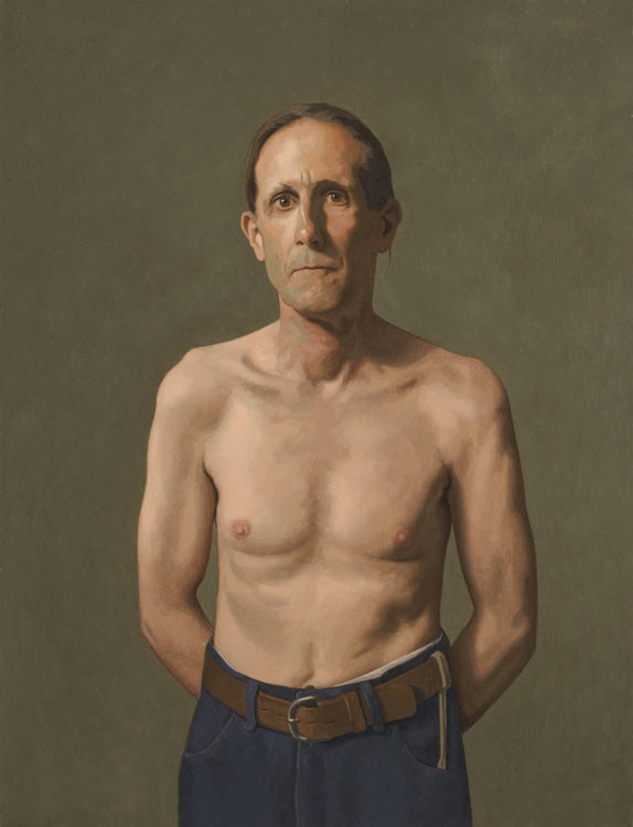
Ultimately, I decided on Photojournalism as the genre for Stagger. One can go many routes in the photojournalism genre: documentary, portraiture, still life, landscape and street. In researching the benefits of going on either of the routes named above, the article, Art: 'Looking' at portraits in Harrisburg attracted me the most. The article mentions Robert Armetta and Catherine Prescott piece on a fellow neighbor, "Ted". The position and expression of the man speaks volume. Although the piece is plain, the man himself generates a complexity to his struggle and life. It stuns me how much a person's appearance and expressions can provoke strong emotions in important aspects of life.


I've decided that portraiture will be the central focus of my magazine because it allows me to tell the story of people of all ethnic, religious, and racial backgrounds. I will be able to give people labeled as minority a voice, which is something of great importance to me. Because an image may only reflect a story partially, I am given an opportunity to inform the public about the importance of topics through the text embedded in the magazine.
I aim to inform the public of local stories which deserve to be voiced nationally.
I also hope to give these stories justice as I exhibit by bringing it to life for the public.
Citation:
     > Afghan Girl. (2018, February 17). Retrieved February 26, 2018, from https://en.wikipedia.org/wiki/Afghan_Girl
     > Photojournalism. (2018, February 17). Retrieved February 26, 2018, from
        https://en.wikipedia.org/wiki/Photojournalism
     > Joseph and Barrie Ann George For The Sentinel. (2018, February 14). Art: 'Looking' at portraits in Harrisburg. 
        Retrieved February 26, 2018, from http://cumberlink.com/entertainment/local-scene/art-looking-at-portraits-in-
        harrisburg/article_f352a02e-58b7-55dd-8062-2a051e1d8eb9.html